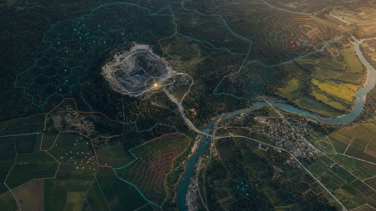
Ask most screening tools where a supplier's risk sits, and they will answer with a country. The mine is in the Democratic Republic of the Congo, the coffee is from Colombia, so the file gets stamped accordingly and everyone moves on. A country turns out to be one of the least useful units you can pick.
ACLED, the standard source for geocoded political violence, has put a number on the gap. Across the states it tracks, conflict covers roughly 15 percent of a state's territory on average, even though almost half of a state can be touched by an internal war over time. A national flag paints the quiet 85 percent with the same brush as the districts where the fighting is. It tells you a country has a problem. It says nothing about whether your supplier is anywhere near it.
That is the job of geospatial intelligence. It takes a coordinate and asks what is true at that point and in the space around it.
Getting closer to the truth means giving up the country as the unit of analysis and working where risk actually lives: at a mine or plot, along a road, or across a district. That is the job of geospatial intelligence. It takes a coordinate and asks what is true at that point and in the space around it. This piece is the technical companion to our argument for sub-national CAHRA identification. That post covered why precise location has become a commercial necessity. This one covers how the data and methods behind it work.
A country is not a risk unit
The people who write the rules already know this. The Responsible Minerals Initiative, in CAHRA guidance aligned with the OECD due diligence framework, makes the point directly: some conflicts are country-wide, but most concentrate in particular regions and districts or around specific sites and actors. Risk is lumpy. It clusters.
The regulatory lists reflect that. The EU's indicative list of conflict-affected and high-risk areas names sub-national units: seven departments in Colombia, eight regions in Burkina Faso, and the whole of the DRC where the risk is genuinely nationwide. In total the list covers 208 regions across 27 countries. A tool that reads that list as a set of country names throws away most of the signal it contains.
This is also why depth matters. Researchers at the Complexity Science Hub Vienna and the Supply Chain Intelligence Institute Austria modelled the European production network, covering 30 million EU firms and some 900 million supply links, to estimate how close the average company sits to a firm implicated in human rights abuses. Their finding is stark. Around 8.5 percent of EU companies are at risk of child or forced labour among their direct suppliers, roughly 82 percent at the second tier, and more than 99 percent by the third. Risk that looks distant at tier one is close to universal three steps down.
Depth and precision are the same problem viewed from two angles. You need to know how far down the chain a risk sits, and you need to know exactly where on the map it sits. Neither question has a country-shaped answer.
Regulators have started asking for coordinates
The strongest reason to build this capability now is that the law increasingly requires it. Due diligence used to mean knowing which company you bought from. It is turning into knowing the exact piece of ground the material came out of.
The clearest example is the EU Deforestation Regulation (EUDR). It converts a compliance obligation into a geospatial data problem, and it does so with unusual precision. Operators must supply geolocation coordinates to six decimal places for every plot a commodity came from. Products from plots without geolocation cannot be placed on the EU market. For plots of four hectares or smaller a single point will do; anything larger needs a polygon that traces the boundary of the land, submitted as a GeoJSON file. That data goes into the EU's TRACES system as a Due Diligence Statement, and records must be kept for five years.
The enforcement design is itself a geospatial exercise. Countries are benchmarked as low, standard, or high risk, which sets the share of consignments inspected at 1, 3, or 9 percent. The TRACES system now runs automated checks that flag a shipment when its coordinates fall in open water or overlap a protected forest. The regulation applies from 30 December 2026 for large and medium operators, and from 30 June 2027 for micro and small enterprises, following the simplifications adopted in Regulation 2025/2650. It covers cattle, cocoa, coffee, palm oil, rubber, soy, and wood, which puts it squarely in front of anyone working in agriculture or FMCG.
The Conflict Minerals Regulation points the same way for the extractive sector. It obliges importers of tin, tantalum, tungsten, and gold to conduct due diligence in line with the OECD guidance, using the sub-national CAHRA list as the trigger for enhanced scrutiny. The list is described as indicative and non-exhaustive, and it is updated on a rolling basis. A static list can only be a starting point. The obligation to assess an area does not lift just because it has not yet been added.
The EU Battery Regulation extends the same logic from the plot of land to the whole chain of custody. From 18 August 2027, following the postponement adopted in Regulation 2025/1561, companies placing batteries on the EU market must run due diligence in line with the OECD guidance across the supply chains of four raw materials: cobalt, lithium, nickel, and natural graphite. That means tracing the chain back to the mine, assessing the areas those mines sit in, and having the whole system verified by a third-party notified body. Six months earlier, from 18 February 2027, every EV battery, light-transport battery, and industrial battery over 2 kWh needs a digital battery passport, a QR-code-accessible record, unique to each battery, carrying information on the battery's origins and due diligence alongside its composition and carbon footprint.
Two details are worth dwelling on. The first is that while the due diligence obligation slipped by two years, the passport deadline held firm, so the requirement to publish a per-battery record arrives before the deadline for the supply chain work that fills it. The second is that the regulation does not demand six-decimal coordinates the way the EUDR does, and the question it forces is spatial all the same. You cannot assess whether your cobalt comes from a conflict-affected or high-risk area without knowing which mine it came from, and a mine is a point on a map. For anyone in mining and metals or the battery value chain, that point is where the assessment has to start.
Put those regulations together and the direction is clear. Compliance now depends on locating where something was produced, using coordinates a machine can check. That is precisely the surface geospatial intelligence operates on.
The stack: what you join to a coordinate
Once a supplier or site is anchored to a coordinate, that point becomes a key you can use to look up every dataset that has a location attached to it. The intelligence comes from the layers, and the layers are independent. Each one answers a different question about the same spot on the earth.
Conflict and security events
The first layer is what has happened nearby. ACLED records political violence and protest events, updates weekly, and geocodes each event to the level of a village, town, or neighbourhood, with a flag indicating how confident that placement is. The Uppsala Conflict Data Program's Georeferenced Event Dataset covers fatal organised violence from 1989 onward and carries a similar spatial fingerprint. With a supplier's coordinate in hand, a question like "how many violent events in the last year within 30 kilometres of this site" becomes a straightforward query.
The asset itself: mines and concessions
The second layer is the thing you are actually assessing. For mining, satellite imagery now supports a global map of the physical footprint. The global-scale mining polygons produced by Maus and colleagues were drawn by experts from Sentinel-2 and high-resolution imagery; the updated version contains 44,929 polygons covering 101,583 square kilometres of mining land, spanning both industrial and artisanal operations.
Where the footprint alone is not enough, field-level data fills the gap. The International Peace Information Service has mapped artisanal mining in eastern DRC since 2009, building a database of more than 2,800 sites from thousands of on-the-ground visits. Each site carries the attributes that decide whether a supply chain is defensible: the mineral produced, the number of workers, the use of mercury, the presence of child labour, and the interference of state and non-state armed groups. The findings show why site-level detail matters. Across surveyed mines, 61 percent of miners work under some form of armed interference, the Congolese army is the single largest interferer, and 85 percent of miners are in gold rather than the 3T minerals. A country flag flattens all of that into one word. This is the layer that feeds real commodity risk work.
Change from space
The third layer is environmental, and it comes from orbit. The Hansen Global Forest Change dataset uses the Landsat archive to track tree cover loss at 30-metre resolution, consistently, every year since 2000. It recorded 2.3 million square kilometres of forest lost worldwide between 2000 and 2012. Near-real-time deforestation alerts, distributed through Global Forest Watch, turn that from an annual retrospective into something closer to a live feed. For EUDR, this is the layer that tests a deforestation-free claim against the 31 December 2020 cut-off, one plot at a time.
Human context
The fourth layer is who is there, and how exposed they are. WorldPop disaggregates census counts down to grid cells of 100 metres or a kilometre, precisely because administrative totals mask the variation inside them. Layered alongside it, Meta's Relative Wealth Index and gridded estimates of GDP and human development add economic vulnerability to the picture. A conflict event five kilometres from a supplier reads one way beside empty scrubland and another beside a town of fifty thousand. The population layer is what tells the two apart.
The geospatial risk stack
| Layer | What it adds | Example open sources | Typical resolution |
|---|---|---|---|
| Conflict and security | What has happened nearby, and when | ACLED, UCDP GED | Village to town, dated to the day |
| The asset | The mine, plot, or facility itself | Maus mining polygons, IPIS site data | Individual site |
| Environmental change | Deforestation and land-use change over time | Hansen Global Forest Change, GFW alerts | 30 metres, annual to near-real-time |
| Human context | Who is exposed, and how vulnerable | WorldPop, Relative Wealth Index | 100 metres to 1 kilometre |
Underneath all four sit the boundaries that make the joins possible: administrative units, protected areas, and concession outlines. These are reference data with their own quirks. Borders move, and names change. UCDP handles this by geocoding events in a time-aware way, so an event in 1989 is coded to the place as it was then, not as it is now. Boundaries are not the neutral backdrop they appear to be.
From a coordinate to an answer
The layers become intelligence through an engineering process with a few well-understood stages.
The first is geocoding: resolving a place name, an address, or a rough description into a coordinate. In the regions that matter most, addresses are sparse and place names are ambiguous, so this step is where a lot of quiet error enters. The second is agreeing on a coordinate reference system. Everything has to share one, and the common choice is WGS84, the same system a GPS reports in. Mixing projections without noticing is a reliable way to corrupt every distance calculation downstream while the numbers still look plausible.
With those settled, the core operations are spatial joins. A point-in-polygon test answers "is this supplier inside a listed high-risk area." A radius or buffer query answers "what falls within 30 kilometres of this point," following a published method for measuring conflict exposure. Tools like PostGIS handle these directly, using spatial indexes to avoid comparing every point against every polygon.
At portfolio scale, indexing is what keeps this tractable. A system like Uber's H3 tiles the globe into hexagons of roughly equal area, across sixteen levels of resolution, and gives each cell a 64-bit integer identifier. Once every point and every region is tagged with its hexagon, a spatial join collapses into an integer match, which a database does extremely fast. One published benchmark moved a query from around nine minutes to roughly a second by making that switch. The trade is honest and worth stating: hexagon indexing buys speed at the cost of some precision, because a cell is an approximation of the true shape. Choosing the resolution is choosing how much of that trade you accept.
Where geospatial risk goes wrong
A map is persuasive in a way that invites overconfidence. The failure modes here are quieter than a missing supplier, and they matter more because the output still looks authoritative. Four are worth naming plainly.
The first is false precision. Six decimal places of latitude implies a location known to within a tenth of a metre, but the underlying event rarely is. The best sources are candid about this. UCDP attaches a precision score from 1 to 7 to every event, where 1 is an exactly known location and higher numbers mean progressively coarser knowledge. When only the region is known, the event is placed at the centre of that region as a placeholder, and the codebook is explicit that the centroid should not be read as the real spot. ACLED publishes precision flags on the same principle. Both organisations publish this uncertainty openly and qualify what each coordinate claims about precision. Problems arise downstream when a platform ingests the coordinates, drops the flags, and renders every point on a map as though it were surveyed.
Precision is a claim, not a fact
How UCDP grades the certainty of an event's location.
- Precision 1: exact location known.
- Precision 2: near a known point, within roughly 25 kilometres.
- Precision 3: somewhere inside a second-order administrative unit, placed at its centre.
- Precision 6 to 7: only the country or region is known.
The second is the modifiable areal unit problem, a mouthful that describes a simple trap. Aggregate the same underlying points into different zones, and the conclusions change with the boundaries you happened to draw. The units are, in the words of the geographer who named the problem, arbitrary and modifiable. A risk map coloured by district can be redrawn into a different-looking map from the same data.
The third is its close cousin, the ecological fallacy: reading a specific site's risk off a district average. This is the exact error that going sub-national is meant to escape. A supplier in a high-risk province may sit in its calmest corner, and a supplier in a quiet province may sit next to the one active mine that funds a militia. Assigning the average to the point reintroduces the country-level blindness one layer down. Precision without this discipline is just a smaller blunt instrument.
The fourth is treating satellite data as ground truth. The Hansen data is remarkable, and it is still a model. Its original validation reported false-positive and false-negative rates around 12 to 13 percent globally, and it can struggle to tell a natural forest from a plantation without local calibration. Coverage and freshness compound the issue, because field data and reliable geocoding thin out in exactly the fragile places where the stakes are highest, and the census behind a population grid may be a decade old. These limits make human judgement essential when interpreting the layers.
Location as the join key
The value lies in what a resolved coordinate unlocks. Anchor a supplier to a location once, and every layer becomes available at that point. You can see nearby conflict and deforestation on the plot alongside the mine's own record and the people exposed around it. One key, many answers.
That structure carries two properties we care about a great deal. It is continuous, because the layers refresh on their own schedules, from ACLED's weekly updates to near-real-time forest alerts. A supplier can be re-screened whenever new signal lands. And it is auditable, because a risk score built this way can be traced back through the specific events, satellite passes, and boundaries that produced it. That is the same principle we hold to across the platform, described in our work on auditable-by-design risk intelligence: a conclusion a regulator, investor, or buyer can follow is worth more than one they have to take on trust. It is also what the EUDR's five-year record-keeping expects of anyone in scope.
This is how we approach supply chain mapping and commodity risk at Aseri: precise location as the spine that the rest of the assessment hangs from. It lets us assess a whole portfolio at the level of individual sites and check every supplier, including those outside priority countries.
If you would like to see what this looks like applied to your own supply chains, get in touch.
Common questions.
Yes. Operators must provide geolocation to six decimal places for each plot a commodity came from, submitted through the TRACES system. Plots of four hectares or smaller can be given as a single point; larger plots need a polygon tracing the boundary. Products without valid geolocation cannot be placed on the EU market.
A point is one coordinate that marks roughly where production happened. A polygon is a closed boundary of several coordinates that describes the whole plot. A polygon lets a satellite check whether any part of that specific land was cleared after the cut-off date, which a single point cannot support.
By resolving the supplier to a coordinate, then running spatial queries against geocoded event data such as ACLED or UCDP. A typical measure is the count and severity of events within a set radius over a set period. Spatial indexing keeps this fast enough to run across a whole portfolio and to repeat it as the data updates.
Because risk concentrates in particular places. Conflict on average affects only a fraction of a country's territory, and regulatory lists like the EU's CAHRA list are themselves written at sub-national level. A country flag treats the safe majority of a territory the same as its most dangerous districts.
The EU Battery Regulation does not ask for coordinates directly. It does require due diligence on cobalt, lithium, nickel, and natural graphite in line with the OECD guidance, which means tracing material back to the mine and assessing the area around it. Answering that question means locating the mine, so the obligation becomes a geospatial one in practice even though the text never says so.
Annual global tree-cover change has been available at 30-metre resolution since 2000, and near-real-time alerts flag likely loss within days to weeks. Both have measurable error rates and serve as inputs to human assessment.